 |
 |
|
AKWAABA!
The friendly folks from AKOFAType would like you to say hello or "akwaaba" to the ADINKRA family of typefaces!
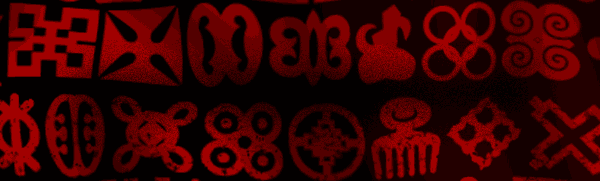
These symbols may seem familiar to you. You've probably noticed them if you love and appreciate African art and culture or noticed the lastest collaboration between the GAP clothing brand and the Product (RED) organization. Now, thanks to AKOFAType, you can have these unique and enduring symbols from West Africa at your fingertips...the possibilities are endless!
THE SKINNY
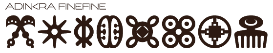
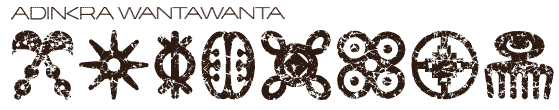
Now I know you may be asking yourself...What's the difference between the three? They look the same to me. Well, yes and no... yes, all 66 symbols displayed within all three typefaces are the same but each typeface is unique. Let's take a look... |
|
|
|
|
|
 |
|
|
The Adinkra family began with the roughest member of the set of three, known as Adinkra Calabash, after a family trip to Ghana...finding the original sources for this font was the most difficult part of the research process since adinkra artwork is a "living" set of pictograms with new characters being adopted literally as a proverb is created (which is a fairly common thing in Ghana). Calabash's rough imperfections are an ode to the traditional method of hand cut gourds used to apply these symbols to cloth and acknowledge the appeal of African art in its imperfection and hand-hewn quality. |
|
|
|
|
|
 |
|
|
However, the only drawback after creating Calabash was that its usage in contemporary applications was very limited since modern applications call for symmetry, balance and in some cases, repetition. With that in mind, we created Adinkra Finefine, a cleaned up and balanced version of Adinkra Calabash. Finefine gets its name from the pidgin English slang for something that is very sharp, classy and cleaned up. |
|
|
|
|
|
 |
|
|
Lastly, upon finishing Adinkra Calabash and Adinkra Finefine, we gained inspiration from wax print and batik fabrics, a staple of West African fashion, and began working diligently on Adinkra Wantawanta. Again, using pidgin English, this typeface can only be explained by the two words "wanta wanta" which connotes a strewn-about and ultra-distressed appearance. |
|
|
|
|
|
BUT...?
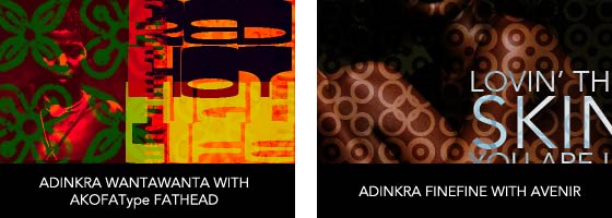
How can you use it, you may ask? Like any other font that you use on a daily basis...the only difference is that it is made of symbols instead of alphabetic characters which makes usage much easier with applications such as Microsoft® Office or the Adobe® Creative Suites. Web pages, magazine layouts, motion graphics, billboards, t-shirts, textiles, repeat patterns, greeting cards, wedding invitations and newsletters are only a few of the virtually limitless uses of the Adinkra typeface family. |
|
|
|
|
|
 |
|
|
|
|
|
SO WHAT ARE YOU WAITING FOR?
Three new styles...66 of West Africa's most recognized icons at your fingertips...Deals on quality typefaces like this don't come along often, so click on the image below to find out more about the ADINKRA family of fonts.
|
|
|
The ADINKRA Typeface Family
From the friendly folks at AKOFAType...where the impossible is only the unthought of...
|
|
|
|
|
 |
|